Showing posts with label visualisation. Show all posts

Tuesday, 7 November 2017

Doubled bar chart labels in Excel

The following bar chart was published on the BBC website


Not withstanding the somewhat gruesome subject matter, my interest was caught by the labelling of the categories. The labels had both the location and the year, with the year in bold and on a second line.

I wondered whether it was possible to achieve this effect using Excel

Forcing the year onto a fresh line can be achieved by inserting a "hard" carriage return. (ALT and ENTER keys at the same time)

Jon Peltier provides a method of adding and then formatting the category labels using a second (dummy) data series. https://peltiertech.com/individual-format-category-axis-labels/. The alignment of the labels can be set to right


I have not yet found a way to selectively apply Bold formatting to the text in the label


Sunday, 5 November 2017

Creating a Fan Chart in Excel


Mary Eleanor Spears provides an example of a ‘Fan Chart’ in her book 'Charting Statistics’ (McGraw Hill Book Company. 1952):


The Fan Chart is in effect a variation of the Slope Chart. It shows relative change rather than absolute change. So all points on the Left Hand side start on zero.

A version can be produced relatively easily in Excel:


This version was made from the following starting data:


The main steps were:

Create a basic line chart from the data
Select Data Source: Switch Row/Column
Delete legend
Delete header
X Axis: set  label position high
Format each data series line colour and thickness
Format Y axis tick marks and line
Format Y axis so that X axis crosses at zero
Format Y axis maximum value to 10
Delete all gridlines
Set X axis position on tick marks
Add data labels (to right)
Delete all LH data labels (carefully so as not to delete RH at same time)
Format each RH label with

  • Series name not value
  • No leader lines
  • Position to Right side

One way to add the shading outside of the data range is to create a second chart and overlay the fan chart. Create a clone of the chart and turn that into an area chart, being careful not to change the size at all. Turn the plot area of the clone grey and turn the fill of the wedges within the data area white

Then copy the line version of the fan chart and position it over the area version (making the top chart see-through by use of 'No Fill') settings). Here is a screenshot of the effect:


Thursday, 2 November 2017

Slope Graphs

The slope graph - or slope chart- is a special type of line chart. It is particularly useful for showing multiple  ‘before and after’ comparisons. It may be either based on rankings or on actual scores.

The slope graph is often said to have been devised by Edward Tufte (he published an example in his ground breaking 1983 book 'The Visual Display of Quantitative Information'). Tufte developed and promoted the idea but did not 'invent' it as such.

A slope graph was published in another book on the visual display of quantitative Information,  69 years before Tufte:


(part of Figure 63, p.65, from 'Graphic Methods for Presenting Facts' 1914 by Willard C Brinton - revised edition 1919)

Another example, more modern and also pre-Tufte, was published by Mary Eleanor Spears in her book 'Practical Charting Techniques'.(McGraw Hill. 1969). She describes it as a Ranking Chart:


Unlike the busy 1914 example, focusing on the change between just two points allows us to read easily. The gradient of the connecting line quickly gives both direction and magnitude. This is a considerable advantage over illustrating with a simple table


Edward Tufte has posted more examples on his website: https://www.edwardtufte.com/bboard/q-and-a-fetch-msg?msg_id=0003nk&topic_id=1 including possibly the earliest ever slope graph (from  Scribner's Statistical Atlas of the United States,1883)

Both Jon Peltier (https://peltiertech.com/slope-graphs-in-excel/) and Stephanie Evergreen (http://stephanieevergreen.com/slopegraph/) have provided step by step details of how to create a slope chart in Excel. The latter is clearer, and is also covered her book 'Effective Data Visualization: The Right Chart for the Right Data'.

Using these instructions, together with a tip from Chandoo, enables us to create an Excel version of Mary Eleanor Spears 1960s original:


Producing this chart in Excel was slow, but not difficult. The labels on the left-hand side were formatted using Stephanie Evergreen's method (making Series and Value visible then omitting the comma between the two).


The following data layout was used to create the Slope Chart in Excel:


Column D is used solely for the Right-Hand labels. It is not included in the ‘Select Data’ range

I could not find a way to reverse the order of Value and Series using Stephanie Evergreen's method. Chandoo pointed out that it is possible to set the value of individual labels using a formula. So, the solution for the right-hand labels is to create the label in another spreadsheet cell and then point each label to the specific cell

This method is quicker than the Evergreen method. Unfortunately, it does not work for the Left-Hand labels – if you want to reuse the chart with refreshed data - as the order is volatile.

A final step might be to format one feature a different colour or intensity to highlight it.

The Slope Chart allows a lot more series to be compared in a single chart than would be sensible with a regular line chart. But what is the upper limit for a Slope Chart? That will depend on the way that you want to use it. Take the following example which compares 44 series in a single chart:  


 From a conventional dashboard perspective, this is now too much to fit with ease on a single screen. So, it will not work easily in an Excel dashboard or PowerPoint slide. But it still works if printed on paper. And it could work in a single screen if set up with a window to roll over the full chart, displaying a portion at a time.

Another approach would be to simplify by removing the labelling


Tuesday, 1 March 2016

Some Books

I have stumbled about in the information arena for many years. Every now and then a particularly noteworthy book comes to my attention. Here are a few:


How to Lie with Statistics by Darrell Huff. Originally published in 1954, with illustrations by Irving Geis. A revised edition was published by Penguin Books (1973) with illustrations by Mel Calman. This was one of the first books I ever bought and is still excellent today
http://www.amazon.co.uk/How-Lie-Statistics-Penguin-Business/dp/0140136290


Meaningful Graphs: Converting Data into Informative Excel Charts 
by James M. Smith  (2014).  I have seen a lot of books on Excel- and owned a quite few over the years. Many are bloated and not very interesting. This one is very good - and one of the few I've felt worth buying since I discovered good online resources, such as Chandoo.org.
http://www.amazon.co.uk/Meaningful-Graphs-Converting-Informative-Charts/dp/0986054909

Dashboards for Excel by Jordan Goldmeier and Purnachandra Duggirala (2015). Apress. A really useful book - it has tips and tricks that would take you years to discover for yourself
https://www.amazon.co.uk/Dashboards-Excel-Jordan-Goldmeier/dp/1430249447

Storytelling with Data: A Data Visualization Guide for Business Professionals by Cole Nussbaumer Knafic. Kindle Books
A really good book. It looks at systematically at the different aspects of communicating using graphs. Because I like the book,  I can forgive the author for her overuse of the word "leveraging"

Some Books by Edward Tufte

http://www.edwardtufte.com/tufte/ebooks
Edward Tufte introduced the term “chartjunk” and the concept of data-ink ratio in his first book, The Visual Display of Quantitative Information (1983). The second edition was published in 2001 (ISBN 0-9613921-4-2).

His second book, Envisioning Information was published in 1990 Graphics Press, ISBN 0-9613921-1-8.(2001)

Visual and Statistical Thinking: Displays of Evidence for Making Decisions (1997) provides two fascinating case studies: the 1854 cholera epidemic and the 1986 Challenger space shuttle disaster


The Cognitive Style of PowerPoint: Pitching Out Corrupts Within (2006). 

So that's two of us who don't like Powerpoint! Hooray!


Visual Explanations: Images and Quantities, Evidence and Narrative
Graphics Press (1997)  ISBN 0-9613921-2-6.

Beautiful Evidence. Graphics Press, ISBN 0-9613921-7-7. 2006 


Some Books by Stephen Few
If you are interested in data visualisation then it is just a matter of time before you encounter Stephen Few. As well as the books listed below, he also publishes a lot of very good short articles, available free, on his website at www.perceptualedge.com


Now You See It: Simple Visualization Techniques for Quantitative Analysis, Stephen Few,  Analytics Press, 2009


Show Me the Numbers: Designing Tables and Graphs to Enlighten, Second Edition, Stephen Few, Analytics Press, 2012

Information Dashboard Design: Displaying data for at-a-glance monitoring, Second Edition, Stephen Few,  Analytics Press, 2013. Although this book is now in its second edition, I only have the first edition at present.

Signal: Understanding What Matters in a World of Noise, Stephen Few, Analytics Press, 2015


Some Books to avoid?
There are some books in which I have been particularly disappointed. At the risk of upsetting their authors, the following are books which I would definitely not recommend:

Using Charts to Create Effective Dashboards by T.Doyle
Having got this electronically to read on a Kindle, I was dispapointed to find that this book is very short and is barely more than a list of types of chart. There is little on dashboard design at all. Most of the samples it provides are good examples of how not to use charts. This book seems even to have vanished from the Amazon Kindle store now, making my copy an endangered species - soon to be deleted.

MS Excel as a Graphics Design Tool by Clarence Bjorkmann
This was an interesting concept but in the end I was left wondering why on earth anybody would want to use Excel in this way when even Windows Paint could produce better results and there are freeware graphics tools available. Furthermore, the graphic design in the book itself is not impressive. £3.47 I wish I'd spent differently. 

Tuesday, 9 February 2016

Losing your RAG


Variations of the Red-Amber-Green "RAG" performance rating system are used extensively. 

A common version is really a two rating (Red-Green) system i.e. where all performance is marked as either pass or fail. When over-used on a table of numbers (not least  with the common practice of colouring whole cells), this can produce a confusing and garish grid. 


A proper three-grade RAG system, including the central Amber, allows more sophisticated ratings to be made. But the Amber rating can be used in two very different ways:

  • Fail but only just
  • Pass but close to fail

Either way, including Amber in the pattern of fully coloured cells just adds further to the over-whelming blast of colour that assaults the reader's brain.

So why, so often,  do we end up with these types of reports and dashboards? 

The whole cell colour aspect  is probably mainly down to ease of production. It is much easier to produce this in say, Excel, than to use less over-whelming devices. 

The extensive use of Green is more curious. It probably indicates a service area where performance has regularly been below target and the people concerned are feeling a bit battered.  Lots of Red is demoralising so every opportunity is taken to proclaim the Green. The same motivation will probably lead to adopting the Amber "fail but only just" option. It removes more Red and it gives a feeling of "nearly there".

But before jumping into producing another one of these grids, the analyst should consider what the report or dashboard is actually trying to communicate. In the end, the main purpose has to be to highlight to managers when they need to make a decision or initiate action. 

This being so, what is the purpose of the Green? There are lots of months where the target was achieved. So what? What action will we take? Apart, possibly, from a momentary congratulation  - none. The Green is where we want to be. Colouring it in may give a sense of assurance, but it does not trigger any management action.

The Red rating is more obvious: we have not achieved the target and we need to do something.

What about Amber? A "fail but only just" statement is still a fail. We still need to do something. What we really need to know is where we met the target (Green) but only just. This is a situation where things may deteriorate and become Red. We may need to take action soon, or be pro-active and take action now, so we need to highlight this.

These considerations suggest that what would be best is a "RA" rating i.e. Red (fail) and Amber (pass but only just) system. Leave everything else un-highlighted on the grounds that there is no need to draw attention to it.

An example could look something like


where Red indicates that we missed the target and Amber indicates that we achieved the target but it was so close to the borderline that we may need to act, or at least keep a close eye on it.

This type of Red-Amber rating system can be developed further to make the Amber look more like a faint Red i.e to use a monochrome (Red-red) system in which tone conveys the meaning. Using this approach, together with some further adjustments to contrast, gives the following alternative:


This illustration uses exactly the same data as the grid above but is set out in a very different way. The idea is to adjust the contrast so that important information stands out and less important information melts into the background. 

Attention is drawn to the latest position rather than to the history of previous results. Indicator 4,  which missed the target is clearly highlighted by the Red marker. Two other indicators (5 and 7), which  only just hit the target, are also highlighted, but in a lighter tone.

The compact visual summary of the last six results then provides additional detail. Indicator 5 has generally been ok so there is probably no need to over-react. Indicator 7 has a history of missing the target. We should continue to monitor it closely.

In conclusion, for dashboards and reports, it may often make sense to abandon the customary RAG systems in favour of a Red-Amber (RA) or Red-red (Rr) as described here.

Finally, another practical reason to abandon the RAG is to help the 10% of males, and 1% of females,  who are colour blind.


References

3 Problems With Traditional KPI Traffic Lights by Stacey Barr. 20/05/2014
(link)

Dashboard Design for Real-Time Situation Awareness by Stephen Few. 2007 (link)


Excel: creating a 'Last Ten Results' indicator panel without using VBA by Edgar Bolton. B I Dashboard Design. 31/01/2016  (link)

Thursday, 28 January 2016

Excel: creating a 'Last Ten Results' indicator panel without using VBA

The BBC website has many good examples of how to display information. The following  device is used to summarise a series of results. 


The BBC use it to display football results in a League Table (see link).  The concept is used more widely in Business intelligence dashboards. There are various approaches to creating this effect. This short article shows a simple way of constructing it using Excel without the need for any VBA coding (Excel skill level: Intermediate). The main idea behind the approach is to use an entire spreadsheet cell for each coloured bar. The colours are controlled by Conditional Formatting.

Step One
Set up a data area. Here, a block of ten successive results by the football team Leicester City F.C. is used. In the illustration, the data is set up on the same worksheet as the dashboard panel. In a real application, the data would probably be held separately. 


Step Two
Each set of bars requires three spreadsheet rows. The middle row is for the coloured bar; the rows either side are clear margins. Similarly,  additional columns are needed between each of the bar cells. Mark out the grid area  by filling each bar cell with a temporary grey background. Then link each bar cell to the corresponding results in the data area.


Step Three
Add Conditional Formatting to the bars. This can be done to the full range as a single block. Three rules will be needed, one for each colour:  In the example, "Win" is to display as Green; "Draw" as Grey and "Loss" as Red. Set the formats so that the font and the background colours are identical, within each rule.


Step Four
If desired, add a light background tint to the whole panel (and set the font colour exactly the same)


Step Five
Shrink the grid by setting column width and row height properties. In the example the following values are used: Bar row 3, margin rows 6, bar columns 1, interval columns 0.17. It may help to zoom to 200% while doing this.


Step Six
To add normal rows of text alongside the bars, merge the three rows in the area adjacent to the bars. This re-creates a more normal row height into which text can be added. When all the row and column adjustments have been made, switch off the grid-lines on the worksheet


It might seem fiddly to set up, but once one line has been created it can be cloned easily. Simply copy and then paste blocks of three rows at a time. 


Enhancements
An additional feature on the BBC website displays the details of each result when the cursor hovers over each coloured bar. A way of adding this type of functionality in Excel (using VBA) is set out in a supplementary article (see link) 


References

Excel: adding interactive drill down to a 'Last Ten Results' indicator panel  by Edgar Bolton. B I Dashboard Design. 31/01/2016  (link)

Excel: Using cell comments to provide "drill-down" details by Edgar Bolton
B I Dashboard Design. 05/08/2015   (link)

Excel: Using arrows to indicate direction of change in performance  by Edgar Bolton
B I Dashboard Design. 26/07/2015   (link)


Wednesday, 5 August 2015

Excel: Using cell comments to provide "drill-down" details

A previous article (link) adapted a sample panel from the BBC website to look at options for creating arrows in Excel to indicate direction of change:


The article covered different ways of creating arrows in Excel and the need to define tolerances to create thresholds for changing arrows. The example Excel rendering introduced additional columns to hold both the previous values and the tolerances. These would be hidden in a real, deployed dashboard.

Some Design Considerations

In terms of dashboard design, the BBC-style panel could be simplified. There is a hierarchy within the information. From most the important downwards, something like:
  • Markets  i.e. what is the whole panel about
  • Each Index and whether up or down (the most important information)
  • The latest value of each index (it could be argued that some people would find % change more important than the actual value) 
  • The % change and/or previous value of each index (in conjunction with present value, these are two versions of the same thing, although % change conveys more information quickly)
  • Full details of the activity of each index over a period of time  (a 'drill down' to the full details for each index can be provided in Excel - as well as on a website - as a hyperlink to a second page of details). 
Re-arranging the panel to reflect the hierarchy:


This simplified design makes the most important information readable at a glance and also relegates the calculated % change data from the panel. 

Cell Comments as a method for providing drill-down

One way to retain access to details from within the panel (without the need to jump to a different page via a hyperlink) is to use cell comments:


Comments can be added to cells manually but this would be extremely time consuming to set up and maintain, and prone to error. To be of real use, the comments need to be generated automatically.

The Worksheet SelectionChange event provides a method for triggering updates. The example above uses the  .AddComment method in VBA to create the comments box itself. The text within the comments box needs to be formatted to control the number of decimal places. Separate lines within the box are created using 'Chr(10)' in the text string.

Cells with a comment are designated in Excel by a small red triangle in the top right hand corner. Microsoft appears to determined to make this feature unalterable. It cannot be adjusted through options, property settings or by using VBA. Workarounds are discussed variously on Excel forums: all seem to rely on creating a differently coloured triangle over the top of the red one. The approach taken here, to avoid having a dashboard covered in unsightly little red triangles, is to wait until the comments are needed before creating them and then delete them again afterwards, straight away.


The VBA code used to generate the example above is as follows:


The details are collated from hidden columns:
  • Column G: contains the percentage change
  • Column H: contains the previous value
  • Column K: contains a brief description of what the index is (for illustrative purposes)
The .visible property is set to true in order to open up the comments box.

Clicking on another cell within the target range in column E will trigger a three stage update:
  • The last generated  comment will be deleted
  • A new comment box will be constructed with the requisite information collated from the values for the same row in Columns G,H and K. 
  • The new box will be opened up (made Visible)
If a cell outside of the target range in column E is clicked on, the last generated  comment will be deleted but no new comment box will be created. All comments will have been removed and there will be no red triangles left behind.

The approach has some limitations: the size and style of the comments box is hard to control (it is not possible to set 'autosize' to true on creation); selecting more than one cell can cause strange results.


Other options

An alternative to using cell comments is to create a text box. This works in a similar way to cell comments. It introduces additional technical challenges, most notably the need to determine the positioning of the box.


References

The VBA used here is a combination of ideas gleaned from various Excel user forums and some original experimentation. Because a lot of material recirculates in forums, it is difficult to trace original ideas reliably back to their creators to give due credit. The following are just a few of those referred to:


Shapes.AddTextbox Method (Excel). Excel 2013 Developer Reference. Microsoft. https://msdn.microsoft.com/en-us/library/office/ff838832.aspx

VBA Tips - Find Out If A Cell Is Within A Range. ExcelExperts.com.21 May, 2009. http://excelexperts.com/VBA-Tips-Find-Out-If-A-Cell-Is-Within-A-Range

Using the Intersect Method in Excel VBA. 

The Complete Guide to Ranges and Cells in Excel VBA by Paul Kelly.2nd January 2015. Excel Macro Mastery. 

How to change comment indicator color in Excel?. ExtendOffice.


Sunday, 26 July 2015

Excel: Using arrows to indicate direction of change in performance

The use of arrows to represent relative change is a common device in performance dashboards and reports. 

Dashboard Example

The following example, from the Business Section of the BBC website (link), shows the latest positions of the four main market indexes:


This representation works well in that it shows at a glance the key information the reader is looking for i.e. whether the main market indexes are up or down

The red arrow next to the current values shows that, on this occasion,  all the main indexes are down. The use of strong, coloured graphics makes this the most prominent information on the panel. This helps achieve the principal objective of dashboard design - to make sure that the most important information stands out and can be read at a glance. 

Alongside the arrow, the actual amount of the drop is also given (in this case as a percentage) also emphasised in colour. Further information is available (on the BBC website) as a drill down accessed by clicking a link on each index name. So there are in effect several levels of information available depending upon how far the reader wants to go. 

Perhaps the most questionable element of the BBC's design is the use of the red coloured ">" symbols next to the names of the market indexes. This may be an example of where the desire to "look good" in a graphic design sense competes with the primary objective of conveying meaning.

Creating direction arrows in Excel

There are two main aspects to determine when using Excel:

  • the graphic design features
  • the calculation of what actually is up, down or the same

Looking at graphics first, there are various ways to simulate the design features in the BBC website example using Microsoft Excel: 

Method One

This approach uses Excel's Conditional Formatting Icon Sets (available from Excel 2007 onwards):


In the illustration above (created using Excel 2013) the 'previous values' of the top two indexes have been adjusted to provide contrasting symbols. Only three main columns are required for the panel itself. An additional column is needed somewhere (it could be a hidden column or referenced from a separate sheet)  to hold the previous values. 

All the work is done in the cells in column E: A simple formula

=(D3-H3)/H3 

calculates the percentage change. Two overlain sets of conditional formatting rules add the icons and the font colours. Icon sets provide the arrows automatically in the same cell as the calculated value. A second set of (more familiar) conditional formatting rules change the font colour.

Advantages of this method are its simplicity and that the features needed are all easily available within Excel core functionality. 

Disadvantages are that older versions of Excel will not be able to use it; that there is inflexibility over the positioning of the icons; the colour strength and definition of the icons are relatively weak; the sizing of the data and arrows is coupled; the shapes do not enlarge very well; changes to thresholds need to be made by editing the details in rule sets, which can be difficult to keep track of on a larger spreadsheet.

The method can be adapted to overcome some of the disadvantages. For example to "uncouple" the arrows from their values for formatting purposes: column E can be duplicated setting  "switch off display values" in one set of cells and removing icon set formatting from the other.

Method Two

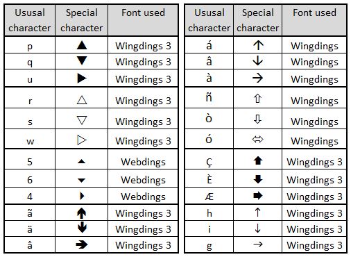
This uses specially chosen fonts to create the arrows. In the illustration below, the arrows are generated from the rendering of the characters  p, q w into the Wingdings 3 font:


The arrows are generated from a nested IF statement


=IF((D3-I3>0),"p",IF((D3-I3)<0,"q","w"))

with the resultant character 'translated' by formatting these particular cells to Wingdings 3. This method requires an additional column to create the panel. It has some advantages over the icon set method: It allows much stronger and sharper arrows which scale better; it allows much more flexibility in positioning; it allows the sizing of the arrows and percentage change figures to be treated independently; it opens up wider choice of symbols used.

Disadvantages are that the special font used needs to be installed on the reader's computer for the method to work (Wingdings 3 is part of the standard Windows build so is a fairly safe choice);  the method relies on character to symbol mappings which do not read intuitively in formulas . Also, this particular rendering of the method does not yet include tolerances, so additional work is needed to incorporate these.

Beyond symbols from the BBC example, there are many other options using this method. The following panel highlights a few:


Other approaches

Excel Shapes provide a number of potentially useful options. For example


These can be added and edited manually or controlled using VBA code. Manual editing makes updating tedious and prone to mistakes. VBA provides a fascinating intellectual challenge from a programming perspective (see References below) but then introduces further issues in how the spreadsheets are distributed and used. The variation in functionality through successive versions of Excel introduces further constraints i.e. it cannot be certain that what works on the originating computer will run or look the same for all end users.

Graphic image files, sourced from outside of Excel,  can theoretically allow for an infinite variety of shapes to be used, for example: 


The disadvantages of graphic image files are similar to those for Excel Shapes. 

Use of either Excel shapes or graphic image files would involve a much greater overhead in setting up and maintaining the spreadsheets compared with the font or icon set methods outlined above. This can only be justified if the desired graphic symbols really cannot be obtained any other way. Before embarking on a VBA heavy spreadsheet, it would be wise to consider honestly whether the desire to impress is eclipsing the desire to communicate. Similar pitfalls can occur with other visual choices in dashboard design.


Calculating what actually is up, down or the same

A change, say,  from 17,569 to 17,571 is, in strict mathematical terms, an increase of 2. The question, in dashboard design terms, is whether this should be considered as an increase or as no significant change. The answer to this will depend upon the specific context. This can then be expressed in calculations through assigning a "tolerance" value. The following panel illustrates how various value changes, all of which have exactly the same arithmetic difference, are interpreted at variety of different tolerances: 


Incorporating tolerances into dashboards

Tolerances can be added to dashboards and reports in a variety of ways. It cannot be assumed that one tolerance value will apply sensibly to an entire dashboard. In fact,  this is unlikely to be the case on many occasions. It is best to allow for each measure on the dashboard to have its own tolerance. 

In the next example, the font method described above has been adapted to include tolerances. An additional column is used to hold the tolerance values:  


The 'nested IF' formula from Method Two needs to be adapted in column E:


=IF((D3>(I3+(I3*H3))),"p",IF(D3<(I3-(I3*H3)),"q","w"))

Additionally, the conditional formatting of column F needs to be altered to keep it in step with column E:


Depending on how it is intended to be used, there is a further option to include the tolerances on the dashboard itself so the user can adjust the values.


References


Excel Dashboards & Reports (2nd Edition) by John Walkenbach and Michael Alexander. May 2013, Wiley.

Mastering Excel: Conditional Formatting by Mark Moore  Kindle Edition. May 2014 (link)

Icon Sets. Excel Easy
http://www.excel-easy.com/examples/icon-sets.html

Programming Excel 2007 and Excel 2010 AutoShapes with VBA by Nicholas Hebb. Peltier Tech Blog.  12th January 2010.


Working with shapes in VBA by Andy Brown. Wise Owl Training. 25 January 2014. http://www.wiseowl.co.uk/blog/s394/shapes.htm