The use of arrows to represent
relative change is a common device in performance dashboards and reports.
Dashboard Example
Dashboard Example
The following example, from the Business Section of the BBC website (link), shows the latest positions of the four main market indexes:

This representation works well in that it shows at a glance the key information the reader is looking for i.e. whether the main market indexes are up or down
The red arrow next to the current values shows that, on this occasion, all the main indexes are down. The use of strong, coloured graphics makes this the most prominent information on the panel. This helps achieve the principal objective of dashboard design - to make sure that the most important information stands out and can be read at a glance.
Alongside the arrow, the actual amount of the drop is also given (in this case as a percentage) also emphasised in colour. Further information is available (on the BBC website) as a drill down accessed by clicking a link on each index name. So there are in effect several levels of information available depending upon how far the reader wants to go.
Perhaps the most questionable element of the BBC's design is the use of the red coloured ">" symbols next to the names of the market indexes. This may be an example of where the desire to "look good" in a graphic design sense competes with the primary objective of conveying meaning.
Creating direction arrows in Excel
There are two main aspects to determine when using Excel:
Looking at graphics first, there are various ways to simulate the design features in the BBC website example using Microsoft Excel:
Method One
This approach uses Excel's Conditional Formatting Icon Sets (available from Excel 2007 onwards):

In the illustration above (created using Excel 2013) the 'previous values' of the top two indexes have been adjusted to provide contrasting symbols. Only three main columns are required for the panel itself. An additional column is needed somewhere (it could be a hidden column or referenced from a separate sheet) to hold the previous values.
All the work is done in the cells in column E: A simple formula
=(D3-H3)/H3
calculates the percentage change. Two overlain sets of conditional formatting rules add the icons and the font colours. Icon sets provide the arrows automatically in the same cell as the calculated value. A second set of (more familiar) conditional formatting rules change the font colour.
Advantages of this method are its simplicity and that the features needed are all easily available within Excel core functionality.
Disadvantages are that older versions of Excel will not be able to use it; that there is inflexibility over the positioning of the icons; the colour strength and definition of the icons are relatively weak; the sizing of the data and arrows is coupled; the shapes do not enlarge very well; changes to thresholds need to be made by editing the details in rule sets, which can be difficult to keep track of on a larger spreadsheet.
The method can be adapted to overcome some of the disadvantages. For example to "uncouple" the arrows from their values for formatting purposes: column E can be duplicated setting "switch off display values" in one set of cells and removing icon set formatting from the other.
Method Two
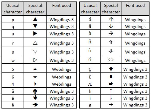
This uses specially chosen fonts to create the arrows. In the illustration below, the arrows are generated from the rendering of the characters p, q w into the Wingdings 3 font:

The arrows are generated from a nested IF statement
with the resultant character 'translated' by formatting these particular cells to Wingdings 3. This method requires an additional column to create the panel. It has some advantages over the icon set method: It allows much stronger and sharper arrows which scale better; it allows much more flexibility in positioning; it allows the sizing of the arrows and percentage change figures to be treated independently; it opens up wider choice of symbols used.
Disadvantages are that the special font used needs to be installed on the reader's computer for the method to work (Wingdings 3 is part of the standard Windows build so is a fairly safe choice); the method relies on character to symbol mappings which do not read intuitively in formulas . Also, this particular rendering of the method does not yet include tolerances, so additional work is needed to incorporate these.
Beyond symbols from the BBC example, there are many other options using this method. The following panel highlights a few:

Other approaches
Excel Shapes provide a number of potentially useful options. For example

These can be added and edited manually or controlled using VBA code. Manual editing makes updating tedious and prone to mistakes. VBA provides a fascinating intellectual challenge from a programming perspective (see References below) but then introduces further issues in how the spreadsheets are distributed and used. The variation in functionality through successive versions of Excel introduces further constraints i.e. it cannot be certain that what works on the originating computer will run or look the same for all end users.
Graphic image files, sourced from outside of Excel, can theoretically allow for an infinite variety of shapes to be used, for example:

The disadvantages of graphic image files are similar to those for Excel Shapes.
Use of either Excel shapes or graphic image files would involve a much greater overhead in setting up and maintaining the spreadsheets compared with the font or icon set methods outlined above. This can only be justified if the desired graphic symbols really cannot be obtained any other way. Before embarking on a VBA heavy spreadsheet, it would be wise to consider honestly whether the desire to impress is eclipsing the desire to communicate. Similar pitfalls can occur with other visual choices in dashboard design.
Calculating what actually is up, down or the same
A change, say, from 17,569 to 17,571 is, in strict mathematical terms, an increase of 2. The question, in dashboard design terms, is whether this should be considered as an increase or as no significant change. The answer to this will depend upon the specific context. This can then be expressed in calculations through assigning a "tolerance" value. The following panel illustrates how various value changes, all of which have exactly the same arithmetic difference, are interpreted at variety of different tolerances:

Incorporating tolerances into dashboards
Tolerances can be added to dashboards and reports in a variety of ways. It cannot be assumed that one tolerance value will apply sensibly to an entire dashboard. In fact, this is unlikely to be the case on many occasions. It is best to allow for each measure on the dashboard to have its own tolerance.
In the next example, the font method described above has been adapted to include tolerances. An additional column is used to hold the tolerance values:

The 'nested IF' formula from Method Two needs to be adapted in column E:
Additionally, the conditional formatting of column F needs to be altered to keep it in step with column E:

Depending on how it is intended to be used, there is a further option to include the tolerances on the dashboard itself so the user can adjust the values.
References
Mastering Excel: Conditional Formatting by Mark Moore Kindle Edition. May 2014 (link)
Icon Sets. Excel Easy
http://www.excel-easy.com/examples/icon-sets.html
Programming Excel 2007 and Excel 2010 AutoShapes with VBA by Nicholas Hebb. Peltier Tech Blog. 12th January 2010.
Working with shapes in VBA by Andy Brown. Wise Owl Training. 25 January 2014. http://www.wiseowl.co.uk/blog/s394/shapes.htm
The red arrow next to the current values shows that, on this occasion, all the main indexes are down. The use of strong, coloured graphics makes this the most prominent information on the panel. This helps achieve the principal objective of dashboard design - to make sure that the most important information stands out and can be read at a glance.
Alongside the arrow, the actual amount of the drop is also given (in this case as a percentage) also emphasised in colour. Further information is available (on the BBC website) as a drill down accessed by clicking a link on each index name. So there are in effect several levels of information available depending upon how far the reader wants to go.
Perhaps the most questionable element of the BBC's design is the use of the red coloured ">" symbols next to the names of the market indexes. This may be an example of where the desire to "look good" in a graphic design sense competes with the primary objective of conveying meaning.
Creating direction arrows in Excel
There are two main aspects to determine when using Excel:
- the graphic design features
- the calculation of what actually is up, down or the same
Looking at graphics first, there are various ways to simulate the design features in the BBC website example using Microsoft Excel:
Method One
This approach uses Excel's Conditional Formatting Icon Sets (available from Excel 2007 onwards):

In the illustration above (created using Excel 2013) the 'previous values' of the top two indexes have been adjusted to provide contrasting symbols. Only three main columns are required for the panel itself. An additional column is needed somewhere (it could be a hidden column or referenced from a separate sheet) to hold the previous values.
All the work is done in the cells in column E: A simple formula
=(D3-H3)/H3
Advantages of this method are its simplicity and that the features needed are all easily available within Excel core functionality.
Disadvantages are that older versions of Excel will not be able to use it; that there is inflexibility over the positioning of the icons; the colour strength and definition of the icons are relatively weak; the sizing of the data and arrows is coupled; the shapes do not enlarge very well; changes to thresholds need to be made by editing the details in rule sets, which can be difficult to keep track of on a larger spreadsheet.
The method can be adapted to overcome some of the disadvantages. For example to "uncouple" the arrows from their values for formatting purposes: column E can be duplicated setting "switch off display values" in one set of cells and removing icon set formatting from the other.
Method Two
This uses specially chosen fonts to create the arrows. In the illustration below, the arrows are generated from the rendering of the characters p, q w into the Wingdings 3 font:

The arrows are generated from a nested IF statement
=IF((D3-I3>0),"p",IF((D3-I3)<0,"q","w"))
Disadvantages are that the special font used needs to be installed on the reader's computer for the method to work (Wingdings 3 is part of the standard Windows build so is a fairly safe choice); the method relies on character to symbol mappings which do not read intuitively in formulas . Also, this particular rendering of the method does not yet include tolerances, so additional work is needed to incorporate these.
Beyond symbols from the BBC example, there are many other options using this method. The following panel highlights a few:
Excel Shapes provide a number of potentially useful options. For example
These can be added and edited manually or controlled using VBA code. Manual editing makes updating tedious and prone to mistakes. VBA provides a fascinating intellectual challenge from a programming perspective (see References below) but then introduces further issues in how the spreadsheets are distributed and used. The variation in functionality through successive versions of Excel introduces further constraints i.e. it cannot be certain that what works on the originating computer will run or look the same for all end users.
Graphic image files, sourced from outside of Excel, can theoretically allow for an infinite variety of shapes to be used, for example:

The disadvantages of graphic image files are similar to those for Excel Shapes.
Use of either Excel shapes or graphic image files would involve a much greater overhead in setting up and maintaining the spreadsheets compared with the font or icon set methods outlined above. This can only be justified if the desired graphic symbols really cannot be obtained any other way. Before embarking on a VBA heavy spreadsheet, it would be wise to consider honestly whether the desire to impress is eclipsing the desire to communicate. Similar pitfalls can occur with other visual choices in dashboard design.
Calculating what actually is up, down or the same
A change, say, from 17,569 to 17,571 is, in strict mathematical terms, an increase of 2. The question, in dashboard design terms, is whether this should be considered as an increase or as no significant change. The answer to this will depend upon the specific context. This can then be expressed in calculations through assigning a "tolerance" value. The following panel illustrates how various value changes, all of which have exactly the same arithmetic difference, are interpreted at variety of different tolerances:

Incorporating tolerances into dashboards
Tolerances can be added to dashboards and reports in a variety of ways. It cannot be assumed that one tolerance value will apply sensibly to an entire dashboard. In fact, this is unlikely to be the case on many occasions. It is best to allow for each measure on the dashboard to have its own tolerance.
In the next example, the font method described above has been adapted to include tolerances. An additional column is used to hold the tolerance values:

The 'nested IF' formula from Method Two needs to be adapted in column E:
=IF((D3>(I3+(I3*H3))),"p",IF(D3<(I3-(I3*H3)),"q","w"))
Additionally, the conditional formatting of column F needs to be altered to keep it in step with column E:

Depending on how it is intended to be used, there is a further option to include the tolerances on the dashboard itself so the user can adjust the values.
References
Excel Dashboards & Reports (2nd Edition) by John Walkenbach and Michael Alexander. May 2013, Wiley.
Mastering Excel: Conditional Formatting by Mark Moore Kindle Edition. May 2014 (link)
Icon Sets. Excel Easy
http://www.excel-easy.com/examples/icon-sets.html
Programming Excel 2007 and Excel 2010 AutoShapes with VBA by Nicholas Hebb. Peltier Tech Blog. 12th January 2010.
Working with shapes in VBA by Andy Brown. Wise Owl Training. 25 January 2014. http://www.wiseowl.co.uk/blog/s394/shapes.htm