Sunday, 12 March 2017

Using a pie chart to show abundance over 12 months

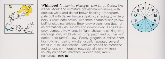
When I'm not sitting at a computer trying to figure out how to get Excel to do things, I like to take wildlife photographs. I've just bought another old bird book from a charity shop: Jim Flegg's Field Guide to the Birds of Britain and Europe (New Holland. 1990)  Amongst other good things, it has an interesting type of chart in it (see the right hand side of the scan sample below):


A simple three scale system is used to indicate, for each month of the year, whether the bird is 

  • not likely to be seen  
  • fairly likely or 
  • highly likely

Although the chart looks superficially like a pie chart, it is more like a choropleth or heatmap. The slices are equal and never change size. They represent the twelve months of the year, running clockwise. The scale is a single-hue progression.


How easy is it to re-create this chart in Excel?

The challenge is to create a "dashboard" version of this chart such as


in which a bird can be selected from a drop-down list with the corresponding data automatically populating the chart.


Concentrating first on how to create the chart itself: It will obviously have to be rendered as an Excel pie chart. The particular issues to resolve are:

  • How to display equal sized slices
  • How to get the month identifier letters displayed inside the slices, rather than a number
  • How to apply the differential slice tones 


The first two are relatively straight forward:

Giving each month an equal numerical value will make the slices the same size. For idiosyncratic personal reasons I have chosen to give each slice the value 30 (because 360 degrees cut into 12 slices would each be 30 degrees) but any equal number will work exactly the same in Excel.

To display the month letter (rather than the number 30) inside each slice, adjust the properties as follows

Use Format Data Labels:

  • Set Label Options to 'Category name' (not to Value, the default)
  • Set Label position to 'Inside end'


The 'tone' of the slices is set by the Fill properties. If you search the internet for ways to control this property you will generally end up programmatic solutions based on Visual Basic. This is an option.

But there is a way of achieving this without using Visual Basic. It requires setting up a Pie Chart with 36 slices.


Each month requires three slices. These are then manually formatted to provide the fills for 'None', 'Medium' and 'High'

The data settings for each month will then determine which slices are displayed:


In the illustration, the values for each month are set in column C

The values graphed are those calculated in column G. These will be 30 if the slice matches the value selected in Column C or otherwise will be zero.

The zero value slices will in effect be omitted. The formula controlling this in Column G is

=IF(H3=VLOOKUP(E3,$B$3:$C$14,2,FALSE),30,0)

The labels are based on column F, which take the first letter of the month name, or if there is a zero value slice are blank. This is calculated through the following formula in column F

=IF(G3>0,LEFT(E3,1),"")

That is all there is to it. To use it in a "real" dashboard, we would put the graph in a separate area (or sheet)  to the calculations and then link the selected values to a data table of all birds


Thursday, 16 February 2017

The Gestalt Laws of Perception


Data visualisation "gurus" promote the importance of keeping things simple. They remind us that our primary purpose is to communicate. They deride the use of flashy, over complicated devices which are intended to impress. Then, with no sense of irony, many devote sections of their books to "The Gestalt Laws of Perception" (or variant phrasings of this).


I wasn't sure what to make of this at first. It reminded me a bit of advertisements which use the device of a man in a white coat to imply that the effectiveness of a product is scientifically proven.

So what relevance does "Gestalt" have to the design of business intelligence dashboards?

Firstly "Gestalt" itself is a branch of Psychology. It is usually said to have been founded by Max Wertheimer (1880-1943), Wolfgang Kohler (1887-1967) and Kurt Koffka (1886-1941) although earlier influences are also cited.

The word "gestalt" is German, translating roughly as "shape" or "form" or "pattern". Gestalt Psychology is interested in how an overall whole is perceived. A therapeutic approach has been developed out of this. But it is the insights into the cognitive processes of perception that interest us for design purposes.

The recognition of the "phi phenomenon" (by Max Wertheimer around
 1912) was an early element in the development of Gestalt ideas. 

Switching a series of static lights on and off in succession can create the appearance of movement.

The animated gif image illustrates this. Sixteen individual "lights" have been set to go on and off in sequence. Our brains interpret the pattern as a single dot moving in a circle. 

This is the basis of animation. The zoetrope and other similar 19th century inventions use this effect.

The tagline of Gestalt - a quotation from Kurt Koffka -  is that "the whole is other than the sum of the parts" (this is different to the sometimes misquoted "the whole is greater than the sum of its parts", which is a definition of synergy)


The Gestalt Psychologists went on to define a set of "Principles" or "Laws" of Visual Perception. Both these words sound a little grandiose to me so  I prefer to call them "effects". While worrying about words, it is also worth noting that the terminology used to describe the effects varies a bit between different writers. There is even some inconsistency regarding how many "laws" there actually are. None of this really matters. It is the visual effects described that we need to understand. The vocabulary is secondary.


Similarity


This is the effect in which similar things are perceived to be related.

Distinctions can be based on different attributes including colour, intensity, shape, orientation, size


Proximity


This is the effect in which things which are close together are perceived to be related


Connection


This is the effect in which things that are connected are perceived as being related


Enclosure

This is the effect in which things which are enclosed are perceived as being related. 

This effect is sometimes alternatively called the law or principle of "segregation" or of "common regions".

In the illustration, the enclosure is achieved using a line. It can also be achieved in other ways, for example with a contrasting background tint.


Common fate


This is the effect, also called "synchrony", in which elements moving in the same direction are perceived as being more related than elements that are stationary or that move in different directions.

This effect obviously makes sense in animated figures rather than in static ones.


Experience


This is the effect in which our past experience directs our perceptions. Having had our attention drawn to the same block of 9 squares in the preceding five illustrations, we look to these squares again for a relationship (even though in this case there is nothing different about them).

This effect is not one of the original Gestalt "laws" as such but it is important.

Experience can be that created within our interaction with the dashboard, report or presentation itself. It can also be shaped by context, such as the "house style" of an organisation or the conventions of a culture.

In addition to all of these, our unique individual life experiences will also come into play. We are more likely to recognize something if we have seen it before.


Continuation


This is the effect in which things arranged in a line are perceived as being related

Addition of two sets of squares either side of the original figure creates the impression of a continuous line through it


Closure


This is the effect in which we tend to fill in the gaps to complete shapes.

(see K.Koffka, Principles of Gestalt Psychology (1935) p.167)

Stronger examples, often used by other writers, are provided by the triangle illusion first produced by Gaetano Kanizsa in 1955 or the well known panda image used in the more recent WWF logo


Simplicity


This is the effect in which we will tend to resolve complex images into the simplest possible forms. For example, the shape in the illustration will most likely be perceived as two overlapping squares

This effect is a core concept in Gestalt and was originally called the "Law of Prägnanz"  also referred to as  "Good Figure".


Object or background


This is the effect, usually referred to as "figure/ground relationship",  in which we try to resolve things as being either objects or background. In the left hand illustration we probably resolve the image as being a dark grey square (the object) on a paler background.

The second image is able to be resolved the other way round i.e. into a large grey square with a small square hole in it. The overall structure of the two illustrations is the same. The fact that the overall page has the same background colour as the little square which influences our perception.

This effect is less predictable than the previous ones. There can be what is sometimes called "unstable" resolution in which the perception switches to and fro between two different versions. The work of M.C.Escher provides many examples where this is entertaining when done deliberately. Accidentally creating this effect, however, runs the risk of becoming distracting.


OK....so what?

Most of the "Gestalt" effects described above are very familiar. We understand them intuitively. When written down, or otherwise presented back to us, they can seem like a statement of the obvious. 

Why,  then,  do we often appear unaware of them when designing our tables, graphs and dashboards?

Probably this is partly because our design decisions can be influenced by other strong factors too, such as the desire to impress (egocentricity) , assumptions about how things are supposed to look (conformity), or the default settings in Excel (popularism)

It is partly also because the interplay between the different effects is not so immediately obvious. There is a loose hierarchy based on the relative strength of the effects in combination:


Proximity is generally stronger than Similarity


Connection is generally stronger than Proximity and Similarity


Enclosure is generally stronger than Connection, Proximity and Similarity

Closure can be stronger than Proximity


The individual effects can also be applied in different intensities. This can have an impact on their interplay.

Once you understand the nature and interplay between these effects you can use them to create deliberate visual hierarchies. These will ensure that the information stands out appropriately in your tables, graphs and dashboards.

This understanding will also help avoid situations where the wrong choices result in things being harder to read than they need be.

The various books and articles listed below contain useful examples and further discussion.


So where did I used to go wrong?

When I look back now at some things that I used to do I can see I was often applying some quick formatting - particularly to tables - which was inharmonious. At the time I probably thought I was making the table (whether in Excel or Word) look "smart" and "professional". I allowed the apparent neatness to obscure the fact that I was making it harder work for the reader.

A typical example would have been to apply a "hierarchy" of thick and thin boxes to the entire table something like:


In terms of the Gestalt effects, I can see that I have used Enclosure - one of the strongest effects - around practically every cell in the table.

With the Gestalt effects in mind, and removing the over-precision in the data, the following is an alternative view of the same table:


This may not be to everybody's taste - possibly not even to mine - but it does illustrate how some Gestalt effects can be employed.

The "zebra stripes" use Similarlity (or arguably a form of Enclosure) to group individual month data together. Some purists would argue against "zebra stripes", saying that the use of white space between the rows can achieve as good an effect. I'm not entirely convinced

Proximity is used to group the four Expenditure columns together. This is further enhanced by the use of the horizontal line over the sub-headings, which is a form of Connection. The subheadings are further joined to their data through the Continuity effect. Similarity of font size is used to distinguish the three Expenditure subheadings from the Expenditure Total and the other columns.

By toning the base font colour down from black to gray, I can then use black for emphasis. The contrasts allow the "bad" month to stand out clearly (I am wanting to draw attention to this)

The table does not need a box drawn around it as the Closure effect already defines it as a block 


References and further reading

Principles of Gestalt PsychologyK.Koffka, 1935. This is a substantial work by one of the founders of the Gestalt movement. It can be found online. Most dashboard designers will probably skip this one. 

Information Visualization. Perception for Design, Second Edition, Colin Ware, Elsevier. 2004. This is a detailed and wide-ranging book. Gestalt laws are covered in the section "Static and Moving Patterns" starting at page 189.

Now You See It: Simple Visualization Techniques for Quantitative Analysis, Stephen Few,  Analytics Press, 2009. A very good book generally. It is more focussed on "pre-attentive attributes" than on Gestalt effects per se.

Show Me the Numbers: Designing Tables and Graphs to Enlighten, Second Edition, Stephen Few, Analytics Press, 2012.
Chapter 5 covers "Visual Perception and Graphical Communication" and the Gestalt principles are discussed explicitly in pages 80-5. 

See also link for a short discussion on visual hierarchies


Information Dashboard Design: Displaying data for at-a-glance monitoring, Second Edition, Stephen Few,  Analytics Press, 2013. 
Chapter 5 covers "Tapping into the Power of Visual Perception" and the Gestalt principles are discussed explicitly in pages 87-91. This is probably the best known of Stephen Few's books and is essential reading for anybody interested in dashboard design.


Dashboards for Excel by Jordan Goldmeier and Purnachandra Duggirala (2015). Apress.
The chapter "What is visual perception and how does it work?" includes a section, pages 36-45 "Our bias towards forms: perception and Gestalt psychology" which expands upon the material covered here. This is a really useful book, which has tips and tricks that would take you years to discover for yourself
https://www.amazon.co.uk/Dashboards-Excel-Jordan-Goldmeier/dp/1430249447

Storytelling with Data: A Data Visualization Guide for Business Professionals by Cole Nussbaumer Knafic. Kindle Books
"The Gestalt principles of visual perception" are covered in locations 1453 to 1556


Data at Work: Best practices for creating effective charts and information graphics in Microsoft Excel (Voices That Matter)  Jorge Camoes. Kindle Books. 2016 
https://www.amazon.co.uk/Data-Work-practices-effective-information-ebook/dp/B01DYIPZF4
Section Two "Visual Perception" covers the "Gestlat Laws" between locations 1453 to 1556


The Functional Art: An introduction to information graphics and visualization (Voices That Matter) by Alberto Cairo. Kindle Books. 2012.

https://www.amazon.co.uk/Functional-Art-introduction-information-visualization-ebook/dp/B0091SXDOM/ref=sr_1_2?s=digital-text
Gestalt is covered in the section 'The Gestalt School of Thought and Pattern Recognition' starting at location 1655


Design Principles: Visual Perception And The Principles Of Gestalt, Steven Bradley,  Smashing Magazine.March 28th, 2014 (link

Sunday, 10 July 2016

I usually like the BBC's data visualisations - but then this happened...

The BBC website generally provides excellent examples of how to present information. I have learnt a lot from studying material produced by the BBC. So imagine my disappointment when I encountered the following today  ( http://www.bbc.co.uk/sport/formula1/36671922):


The first issue is why the BBC felt that it was necessary to have a chart at all. There are three drivers having won 5, 4 and 3 times respectively. A simple table, such as the following, would have conveyed this information more clearly


Aside form the poor use of font weight, the BBC chart has managed to get the drivers' names to align vertically, making them hard to read. Choosing a horizontal bar chart, rather than a vertical column chart, would have avoided this. For example:


I think the graph above is entirely clear. But if the BBC needed to add some more visual interest, they could have added further embellishments,  such as using a pictograph:


This is quite easy to do with Excel. The example above took about ten minutes, most of which was creating a suitable image file. With a  little more time and care it could be made much more aesthetically pleasing, although for some reason these types of graphs always make me think of the 1950s.

Perhaps later today the BBC may update their graphic - maybe on aesthetic grounds - but preferably also because the data will have changed!


Sunday, 3 July 2016

Creating non-standard charts in Excel: shadow bars

There are types of chart which are not offered as part of Excel's standard library but which can be produced with a little imagination and perseverance, This short article explains how to produce  a "shadow bar" chart such as in the following illustration:


In dashboards, this type of chart might be useful for summarising a "balanced scorecard" where individual indicators are grouped under thematic headings. Current performance is shown in the RAG total bars. Muted colours are then used to show the previous values so that relative change can be gauged quickly

Although not offered as part of the standard set of templates, this type of graph can be produced in Excel. One way to is to produce two separate charts, make one transparent and position it carefully over the other.


Step-by-step 

Set out the data (noting the layout of rows and columns):


Highlight the first block ("Latest") and insert  100% Stacked Bar graph . Depending on Excel version and settings, this will produce something like the following (Excel 2016):


Make the following changes (exactly how will vary between Excel versions):

  • Get rid of the Chart Title 
  • Get rid of the Legend
  • Get rid of Horizontal Axis Labels
  • Get rid of the Horizontal Axis Gridlines
  • Get rid of Chart Border line
  • Increase the font size of the series labels
  • Format Data Series Colours to Red,Orange and Green to better reflect RAG


You will have produced something similar to the following:


Now create a copy of this entire graph. This will be used for the "Previous" shadow values. Working on the copy, make the following changes:

  • Change the Data Source to the alternate data set
  • Format Data Series Colours to muted shadow colours (greys have been used here)
  • Format the Colour of the Series labels to White (or whatever other background colour)
You will have produced something similar to the following:


Next, change the Chart Area of the original ("Current") graph to No Fill. It can now be positioned over the top of the shadow graph and the positions fine tuned to given the desired effect.


Various refinements and embellishments can be added but beware of making the final product too "busy".


Monday, 30 May 2016

What do we mean by “dashboards”?

The word “dashboard” originally referred to the board at the front of a horse drawn carriage which shielded the occupants from mud spattered (“dashed”) up by the horses’ hooves.

The dashboard was retained in horseless carriages. It became a convenient place to fix instruments so developed a new meaning as an alternative to “instrument panel”

The word “dashboard” was adopted by business information specialists somewhere around the early 1990s through the analogy between a car dashboard and a collection of “controls” for monitoring information.

The information use of the term “dashboard” became increasingly widespread from around the late 1990s. Many system suppliers took the car analogy a little too literally. Developers tried to recreate car dashboard visual characteristics in information dashboard products. Some of these products were visually stunning whilst at the same time being relatively ineffective for their supposed primary purpose.

Such excesses have been reeled back in slightly by the efforts of visualization gurus such as Edward Tufte and Stephen Few

We are now at a point where widespread over-use of the word “dashboard” has almost stripped it of any meaning

Use of terminology varies but the following concepts can be distinguished:

A single screen (or page of paper) which summarises at a glance the current position of one or more key measures for an organization or enterprise: I call this a dashboard

A more extensive collation, perhaps showing trends or a detailed breakdown of one or more key measures for an organisation or enterprise, and quite likely including commentary: I call this a report

A collection of the key indicators for an organisation, sub-organisation or enterprise: I call this an indictor set

One or more overall scores can be collated to provide a summary of an indicator set: I call this a scorecard  (the term “balanced scorecard” is widely used but for me to agree to use it I would need to have it explained how the balancing has been carried out)

A dashboard or report in which the user can obtain different versions of the information by entering choices: I call this an interactive dashboard or an interactive report


Monday, 28 March 2016

A four-layer design for an Excel-based dashboard

When producing dashboards and reports in Excel it is tempting to build them as a single entity. There are good reasons to take a more modular approach. The modules can be visualised as a series of connected layers;


In their book Excel Dashboards and Reports, Michael.Alexander and John Walkenbach recommend a data model with three layers: data, analysis and presentation.The "analysis" layer is seen as a staging area.

The four level model set out here is similar, but  a separation is made been calculation and collation.

Where possible it is best to avoid having any data calculations in the Presentation Layer, This allows alternative versions of the Presentation to use the same data with limited risk of introducing inconsistencies.

Calculations are made as close as possible to the source Data

Although the data model has four layers, this does not necessarily mean that it is constructed in four different files. The physical design will depend upon the size and complexity of  the dashboard. It would be possible to have all four layers within a single Excel file.

Bibliography

Dashboards for Excel. by Jordan Goldmeier and Purnachandra Duggirala. Kindle Edition. APress 2015

Excel Dashboards and Reports, Michael.Alexander and John Walkenbach .