https://www.perceptualedge.com/articles/misc/Bullet_Graph_Design_Spec.pdf
It is intended as a replacement for the ‘speedometer’ style dashboard gauges. These started appearing in the 1990s but are now regarded as a poor design choice.
The bullet chart shows a single measure. It can show this relative to several comparators. Typically this is a target and ranges of low, medium and high

For example, a bullet chart could be used to show NHS performance against the national target (95%) for 4 hour waits in A&E. This can be shown against a back-drop of the range of performance by peer organisations

Excel does not currently provide a bullet chart as part of its standard chart gallery. These charts can be produced in Excel. But doing this requires ‘bending’ Excel slightly to make it do what we need.
There are numerous blog articles available giving instructions on how to do this. I think Jon Peltier has produced one of the best. I have borrowed many of his ideas. Most solutions use a combination chart and adapted error bars.
There are some questions to answer before we start
- Do we want a horizontal bullet chart (bar) or a vertical (column)?
- Do we want a single bullet chart on its own or several together?
- Do we want a legend on the chart?
I think the horizontal version works best (although it is slightly more complicated to set up in Excel). The sections below show how to do this in Excel.
Single horizontal bullet chart (with or without legend)
This method mixes three bar data series and two scattergram series (which we need to position parts of error bars from).
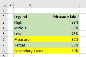
You will need to set out the source data as follows:

Step One
Highlight the cells which cover the Low, Middle and High ranges (yellow in the screenshot – do not highlight the entire block of data).
Use this range to insert a Clustered Bar Chart.
If the result looks like this

You will need to Select Data… and Switch Row and Column to get the following:

Step Two
If you want a legend, add it now.
Format the fill of the three bars to reflect the desired grey scale.

Then adjust the bar properties to 100% overlap and 50% gap width

Reduce the height of the overall chart to condense the bar height

Step Three
We now need to add the two remaining data series. We add them one at a time. Because we are using a scattergram type for these series, we need two measures for each point. The 'secondary y axis' measure is used to control the vertical position of the marker. 50% (or 0.5) will allow us to make it central
Select the Measure range and the Secondary Y axis range together (hold control key) then Copy
Click on the chart to select it.
Then select Paste Special and set options as follows

The new series should appear added like this

Select the new series and change its chart type to Scatter (X Y)

Step Four
If you want the legend, you will need to change the labelling and adjust the colour of the fill
If you do not want a legend, do not bother with this step as we will be hiding the marker later

Step Five
Adjust the secondary Y axis properties to run from 0 to 100% (this forces the 50% to the middle) then delete it

Step Six
Add the final data series in similar fashion to Step Three. Highlight the range (yellow in the screenshot) and Paste Special into the Chart
Add the final data series in similar fashion to Step Three. Highlight the range (yellow in the screenshot) and Paste Special into the Chart


Step Seven
If you want the legend, reformat the data series and adjust the label

Step Eight
Add error bars to Target data series
Delete the horizontal error bars
Format the vertical error bars
Add error bars to Target data series
Delete the horizontal error bars
Format the vertical error bars
- End style No cap
- Error amount fixed value 0.3
- Bar colour
- Increase Bar width to 1.5pt or greater

Then highlight the Target data point and set marker to None

This removes the marker leaving the error bar behind (and leaves the Legend intact if you want this)
Step Nine
Add error bars to Measure data series
Delete the vertical error bars
Format the horizontal error bars
- Direction minus
- End style No cap
- Error amount percentage 100%
- Bar colour as required (red in this illustration)
- Increase Bar width to 5pt or greater
Highlight the data point and set marker to None

Step Ten
Format to suit

If you don’t want the legend you can omit steps four and seven
No comments:
Post a Comment