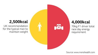
How easy is it to produce illustrations like this using Excel?
One way is to produce two separate pie charts and then overlap them. To do this you need to make each pie chart from two equal values - to get the exact halves. Then set the format of the 'unwanted' half (Data Point) to Fill: No fill and Border: No Line. Apply the same settings to the overall Chart Area too.
The larger side will need to be made appropriately bigger. Without measuring the original, I cannot tell if the areas of each half are in exact proportion to the two numbers (if not we will be in big trouble with the data visualisation gurus). To prove the idea (and since it is a Sunday morning and I have only had one cup of coffee) I have simply enlarged it by eye by dragging the corner of the Chart Area. It would be possible to calculate the exact chart size
To create the text blocks, simply put each element of text on a separate row, select appropriate font settings, then left or right align accordingly:
To assemble the chart, work from the left had side and position the two transparent half pies. Adjust a column width to align the right hand text block.
Then get rid of the grid lines
The only things to add are the white person and F1 car icons in the two halves. This is a bit of a challenge. You would need to find or create white shapes with a clear background
In Excel 2016 you can draw these on using a Pen from the Draw menu (set ink to white)
It is probably easiest to draw with the View set to a high Zoom
If you set Convert Ink to Shape then you can create movable and resizable objects.
OK, I think my man would probably benefit from Lewis Hamilton's vegan diet....but with a little more time we could produce anything in this way - should you like this kind of chart


No comments:
Post a Comment