William Playfair is generally credited with inventing the pie chart, publishing a variety in 1801 [See Note 1]. The following is a much used illustration, taken from a larger more complex chart:

The name “pie chart”, which may date back to the 1920s,
derives from the resemblance of the chart to a pie divided into portions. In
France it became known as “le camembert” through its resemblance to the shape
of the cheese.
The pie chart requires segments (“slices”) to be constructed exactly. The angle of each segment must be calculated to reflect its proportion of the whole. Before the advent of computers, drawing a pie chart in ink could be tricky
involving the use of a protractor and a beam compass. Fortunately, these days, most analysts will never have to attempt this.
Modern computing allows pie charts to be constructed in a matter of seconds. Excel 2016 provides the following types as standard:
These can be used with various effects, including exploded slices. - Pie
- Pie of pie – one segment is subdivided in a second pie chart
- Bar of Pie – one segment is subdivided in a second chart, bar not pie
- 3D pie – a “pleasing” 3 dimensional view
- Doughnut (or “Donut”) – like a pie but with the middle removed
If its origins can be traced back over 200 years, criticism of the
pie chart can be traced back over one hundred years:
“the circle with sectors is not a
desirable form of presentation" [See Note 2]
Many people today, including some prominent opinion formers,
deprecate the use of pie charts. This criticism is echoed widely [See Note 3]. A person newly embarking on a career as an analyst would be
forgiven for developing a view that using a pie chart would be a declaration of
incompetence.
Certainly there are abundant examples of pie charts
being used badly. But does it follow that every
possible use of a pie chart could be replaced favourably by alternatives?
The two-slice pie chart
The readability of a pie chart generally declines as the number of slices is increased. The pie chart probably works best when there are only two slices.
As an illustration, the following simple chart shows the result of the recent UK referendum on EU membership (the "Brexit" vote):

This example chart was produced quickly in Excel, with a few adjustments from the default settings. While this is far from spectacular, it works as an illustration of the result and its "narrowness". The colour scheme is based on that used by the two sides in the referendum campaign, rather than being based purely on aesthetics.
It could be argued that a two-number result is a relatively simple situation so may not need an illustration at all. But the underlying concept of a dashboard - to provide information "at a glance" - suggests that the overall result of a referendum is likely to be the most important piece of information and should therefore be given prominence.
So how does the two-slice pie chart compare with some simple alternatives?
Alternative: Simple Free text statement
Is this better than use of a two-slice pie chart? It conveys the information in a compact manner, but it lacks impact and emphasis. The reader has to perform a mental comparison having assimilated the numbers.
Alternative: Free text statement with additional emphasis
Alternative: Table
Is this better than use of a two-slice pie chart? It is compact and provides all the information. But there is no impact or emphasis and the reader still has to perform a mental comparison.
Alternative: Simple column graph

Is this better than use of a two-slice pie chart? It provides much of the same impact and emphasis. But (as set out here at least) it lacks overall coherence. It could also be argued that the pie chart perhaps gives a better impression of the interdependence (and reciprocal "swing") between the two parts. It it hard to argue that the column chart above is vastly superior to the two-slice pie.
Alternative: Simple bar graph

Is this better than use of a two-slice pie chart? It is really just a "tipped over" version of the simple column chart, so many of the same arguments apply. The bar chart has some definite advantages over the column chart in that the alignments make it much more readable. But, again, it is hard to argue that it significantly out-performs the two-slice pie as a device in this situation.
Alternative: Stacked "Percentage" bar graph

Is this better than use of a two-slice pie chart? This is in effect a rectangular pie chart. The two-slice pie has at least one advantage in that it automatically contains a line (the top "cut") which is aligned vertically and against which the position of the split (the second "cut") can be judged visually The bar graph only has a single line dividing the two portions so we would need to add a second line at the 50% mark to enable the same kind of visual comparison.

In my opinion, this last simple example - the stacked percentage bar graph with added line - more or less matches the two-slice pie chart in overall effectiveness. The pie chart is arguably a slightly better choice for instant communication, being the more familiar. The bar chart is maybe a better choice in terms of efficient use of space within a report or dashboard.
In conclusion, the two-slice pie definitely holds its own, and is arguably better than any of these a simple alternatives. Not everybody will agree. It may become a matter of stylistic choice, or simple personal preference
It may look, from my comments above, as if I am taking a general stand in favour of the pie chart against the anti-pie masses. This is not the case. The "beauty contest" above was looking only at the very simplest of situations: a comparison between two parts of a single whole. As the complexity of the situation increases, I believe that the pie chart quickly begins to struggle to compete.
Side-by-side comparison: two-slice pie charts
For more complex situations, first let's look at how well the two-slice pie chart fares when side by side comparisons are required:
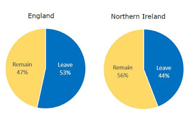
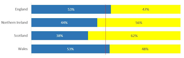
If we want to look at the UK referendum results within the different UK countries, we can compare two side by side as in the above. I think this works as an illustration.
What about comparing three countries?
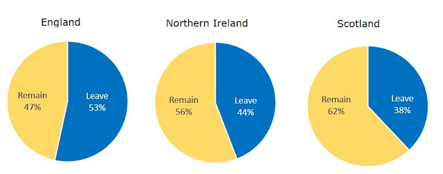
Personally, I am having to start a bit of visual gymnastics at this point. I can still read the information and make the comparisons, but it is becoming harder with my eyes having to dart backwards and forwards between different parts of the illustration
What about comparing four countries?
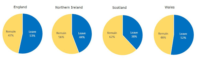
Well this arrangement is definitely hard work for me. It would probably be better if the four pies were arranged in a square, some thing more like:
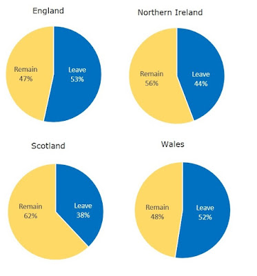
Even adjusting the arrangement, I find this illustration far from ideal.
How does it compare with an alternative such as the stacked percentage bar chart?
In my opinion the stacked bar chart is much more effective than four side by side two-slice pie charts. It is also much quicker to set up in Excel as it is all contained within a single chart - the only complicating aspect being my choice to add a line at the 50% mark. The pie chart approach requires setting up four individual graphs and then aligning them - or their snapshot images. Subtle issues with sizing and positioning would need to be dealt with if I was using this approach "for real".
So, in conclusion, comparing two side-by-side two-slice pie charts works ok; comparing three is less good and may be done better using other approaches; comparing four is definitely less effective than alternatives such as the stacked percentage bar chart.
The three-slice pie chart
The 1801 example from William Playfair is a three-slice pie chart. Here it is again with a quick re-rendering in Excel 2016:

The readability of a pie chart generally declines as the number of slices is increased. The pie chart probably works best when there are only two slices.
As an illustration, the following simple chart shows the result of the recent UK referendum on EU membership (the "Brexit" vote):

This example chart was produced quickly in Excel, with a few adjustments from the default settings. While this is far from spectacular, it works as an illustration of the result and its "narrowness". The colour scheme is based on that used by the two sides in the referendum campaign, rather than being based purely on aesthetics.
It could be argued that a two-number result is a relatively simple situation so may not need an illustration at all. But the underlying concept of a dashboard - to provide information "at a glance" - suggests that the overall result of a referendum is likely to be the most important piece of information and should therefore be given prominence.
So how does the two-slice pie chart compare with some simple alternatives?
Alternative: Simple Free text statement
51.9% voted Leave and 48.1% voted Remain
Is this better than use of a two-slice pie chart? It conveys the information in a compact manner, but it lacks impact and emphasis. The reader has to perform a mental comparison having assimilated the numbers.
Alternative: Free text statement with additional emphasis
51.9% voted Leave and 48.1% voted RemainIs this better than use of a two-slice pie chart? It has more impact and emphasis but it still lacks something. It is idiosyncratic and one step towards becoming something like a "word cloud" or "call out". The reader still has to perform a mental comparison.
Alternative: Table
| Outcome | Votes | Percentage |
| Leave | 17410742 | 51.9% |
| Remain | 16141241 | 48.1% |
Is this better than use of a two-slice pie chart? It is compact and provides all the information. But there is no impact or emphasis and the reader still has to perform a mental comparison.
Alternative: Simple column graph

Is this better than use of a two-slice pie chart? It provides much of the same impact and emphasis. But (as set out here at least) it lacks overall coherence. It could also be argued that the pie chart perhaps gives a better impression of the interdependence (and reciprocal "swing") between the two parts. It it hard to argue that the column chart above is vastly superior to the two-slice pie.
Alternative: Simple bar graph

Is this better than use of a two-slice pie chart? It is really just a "tipped over" version of the simple column chart, so many of the same arguments apply. The bar chart has some definite advantages over the column chart in that the alignments make it much more readable. But, again, it is hard to argue that it significantly out-performs the two-slice pie as a device in this situation.
Alternative: Stacked "Percentage" bar graph

Is this better than use of a two-slice pie chart? This is in effect a rectangular pie chart. The two-slice pie has at least one advantage in that it automatically contains a line (the top "cut") which is aligned vertically and against which the position of the split (the second "cut") can be judged visually The bar graph only has a single line dividing the two portions so we would need to add a second line at the 50% mark to enable the same kind of visual comparison.

In my opinion, this last simple example - the stacked percentage bar graph with added line - more or less matches the two-slice pie chart in overall effectiveness. The pie chart is arguably a slightly better choice for instant communication, being the more familiar. The bar chart is maybe a better choice in terms of efficient use of space within a report or dashboard.
In conclusion, the two-slice pie definitely holds its own, and is arguably better than any of these a simple alternatives. Not everybody will agree. It may become a matter of stylistic choice, or simple personal preference
It may look, from my comments above, as if I am taking a general stand in favour of the pie chart against the anti-pie masses. This is not the case. The "beauty contest" above was looking only at the very simplest of situations: a comparison between two parts of a single whole. As the complexity of the situation increases, I believe that the pie chart quickly begins to struggle to compete.
Side-by-side comparison: two-slice pie charts
For more complex situations, first let's look at how well the two-slice pie chart fares when side by side comparisons are required:

If we want to look at the UK referendum results within the different UK countries, we can compare two side by side as in the above. I think this works as an illustration.
What about comparing three countries?

Personally, I am having to start a bit of visual gymnastics at this point. I can still read the information and make the comparisons, but it is becoming harder with my eyes having to dart backwards and forwards between different parts of the illustration
What about comparing four countries?

Well this arrangement is definitely hard work for me. It would probably be better if the four pies were arranged in a square, some thing more like:

Even adjusting the arrangement, I find this illustration far from ideal.
How does it compare with an alternative such as the stacked percentage bar chart?

In my opinion the stacked bar chart is much more effective than four side by side two-slice pie charts. It is also much quicker to set up in Excel as it is all contained within a single chart - the only complicating aspect being my choice to add a line at the 50% mark. The pie chart approach requires setting up four individual graphs and then aligning them - or their snapshot images. Subtle issues with sizing and positioning would need to be dealt with if I was using this approach "for real".
So, in conclusion, comparing two side-by-side two-slice pie charts works ok; comparing three is less good and may be done better using other approaches; comparing four is definitely less effective than alternatives such as the stacked percentage bar chart.
The three-slice pie chart
The 1801 example from William Playfair is a three-slice pie chart. Here it is again with a quick re-rendering in Excel 2016:

The graph (which is actually part of a larger more complex illustration) shows the proportional split of the then Turkish Empire into three parts (African, European an Asian). I think that this particular three-slice pie chart works. But many three-slice pie charts will not work so well. It is a combination of features that work in favour of the Playfair chart: The "European" slice is pretty much an exact quarter and the sizes of the three slices are not similar to each other. Playfair was blissfully unaware of the conventions that Excel and generations of statisticians would impose upon his idea: by default these would tend to arrange the slices clockwise in order of decreasing size.

In my opinion the clockwise "default" version is slightly less effective than Playfair's original, due largely to the fact that it loses the near horizontal "3 o'clock" line. The chart still works because the three segments are quite different in size.
When the segments are of similar size, things get harder:

How easy is it to tell the relative sizes of the three slices in the adjusted graph above? I think it is not easy. We would have to add the actual numbers (121%,120%,119%). How does this compare to alternatives, such as a column chart?

Well the column chart is not particularly easy either in this situation (the insipid colours do not help), but it is possible to make out the relative sizes of the three constituents. So this type of chart does seem more effective at dealing with the same fine margins (1%).
Unlike the three-slice pie chart, which fails, the two-slice pie chart can also handle differences of around 1%:

In conclusion, there are some situations in which a three-slice pie will work and some in which it will not work. These depend largely upon the data. This means that if a three-slice pie is used in a dashboard, it becomes unpredictable whether it will be effective or not as the data is refreshed. This would tend to make it an unreliable choice.
The verdict on simple pie charts?
I've tried to look at the merits of the pie chart afresh, ignoring the various views expressed by others. My conclusion is that there are some cases - simple two-slice pie charts and side-by-side comparisons of two two-slice pie charts - where it is an effective option. There are situations - such as three-slice pie charts when it can be effective, but it can also be ineffective depending upon the actual data used. So this makes a three- (or more) slice pie chart a risky choice in a dynamic dashboard. In one-off reports with static data, three- or more slice pie charts may be an effective option but a judgement would need to be made on a case-by-case basis. As a rule, I think I would avoid anything over three slices and I would avoid side-by-side comparisons of more than two pie charts.
Finally, the whistles and bells: pie chart variants
Apart from the "standard" pie chart, Excel offers a numbers of additional types and features. How effective are these and when should they be used (or avoided)?
(a) Pie of pie
One segment is subdivided into a second pie chart. This seems to be a messy compromise acknowledging that a pie chart struggles to be effective when the number of slices increases. But attempting to "solve" this by spilling over into a second pie chart produces a confusing overall pattern
(b) Bar of Pie
One segment is subdivided in a second chart, but as a bar not as a second pie chart. This suffers from many of the same deficiencies as the pie of pie
(c) 3D pie
A “pleasing” 3 dimensional view. These 3D charts can be made aesthetically very pleasing but distort the relative sizes of the slices, making the data even harder to read than from a 2D pie chart. These charts may therefore appeal to those making sales presentations but tend to be abhorred by analysts. In the end, the question is what the purpose of the chart is in its context
(d) Doughnut (or “Donut”)
This is like a pie chart but with the middle removed. They are very popular in commercial dashboard software. They have most of the same strengths and weaknesses as a regular pie chart but with the added difficulty of making the areas even harder to assess. So unless the objective is to save on printer ink, a straight swap of a doughnut chart for a pie chart offers little advantage
The doughnut chart can be set up in two different ways: like a pie chart with a hole in it or like an "onion"
[1] See I.Spence. No Humble Pie: The Origins and Usage of a Statistical Chart. Journal of Educational and Behavioral Statistics. Winter 2005, Vol. 30, No. 4, pp. 353–368
[2] W.C. Brinton in the book Graphic methods for presenting facts. 1914. New York.
[3] For a selection:
https://www.stevefenton.co.uk/2009/04/pie-charts-are-bad/
http://kosara.net/publications/Skau-EuroVis-2016.html
http://www.businessinsider.com/pie-charts-are-the-worst-2013-6?IR=T
http://www.storytellingwithdata.com/blog/2011/07/death-to-pie-charts
https://www.quora.com/How-and-why-are-pie-charts-considered-evil-by-data-visualization-experts
https://www.geckoboard.com/blog/pie-charts/#.WMr7svnyjtQ
https://twitter.com/EdwardTufte


